Free Color Tool · Used by designers, artists, and students
Complementary Colors — Find Any Color's Opposite Instantly
Find the perfect complementary color for any shade instantly with our powerful Complementary Colors tool. Whether you're a designer, developer, artist, or student, this free online color generator helps you discover the exact opposite color on the color wheel in seconds. Simply enter a HEX, RGB, or HSL value, and get accurate complementary color results along with a visually appealing color preview.
Complementary Color Finder
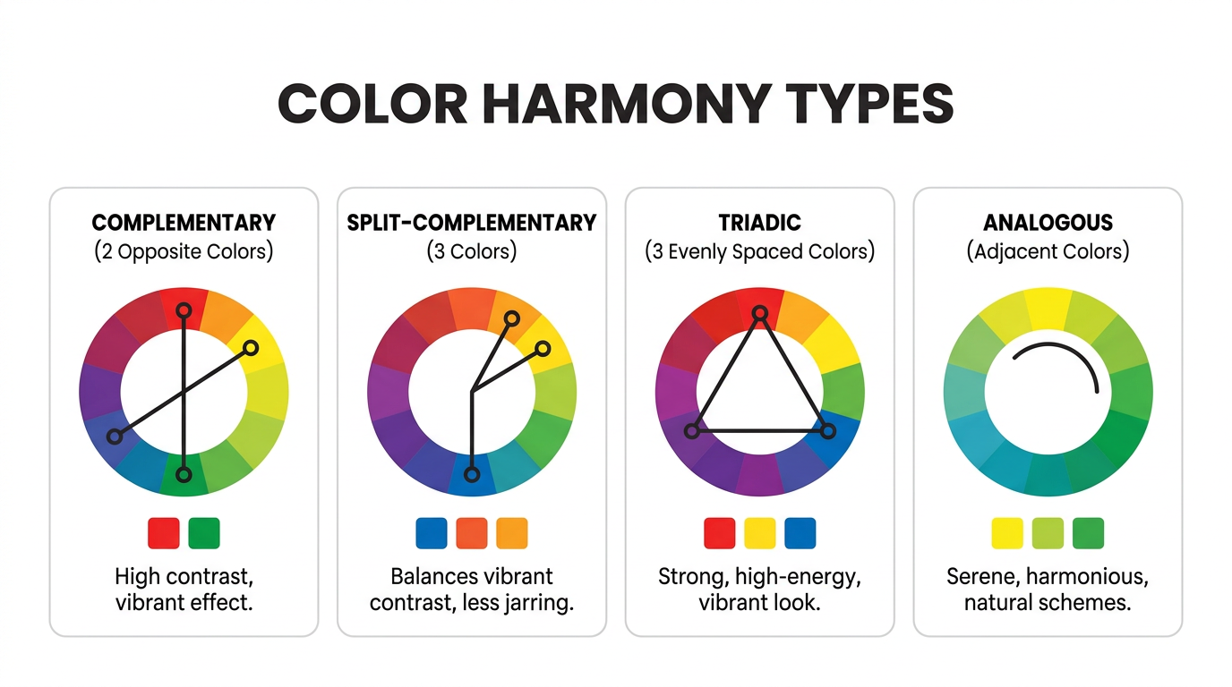
Split-complementary
Triadic
Analogous
Understanding complementary colors is essential for creating high-contrast designs, improving readability, and building eye-catching color palettes. Our tool makes it easy to experiment with color combinations for websites, fashion, graphics, branding, UI/UX design, and more.
✨ Key Features:
- Instant complementary color generator
- Supports HEX, RGB, and HSL formats
- Live color preview and palette suggestions
- User-friendly and mobile-responsive design
- Perfect for designers, developers, and creatives
Boost your design workflow and create stunning visuals with the right color combinations. Try our complementary color finder now and bring harmony and contrast to your projects effortlessly!
Saved Palettes
Quick Color Pair Shortcuts
Click a pair to load it into the tool above.
Color Harmony Explorer
See five harmony types for any color. Uses your current selection from the tool above.
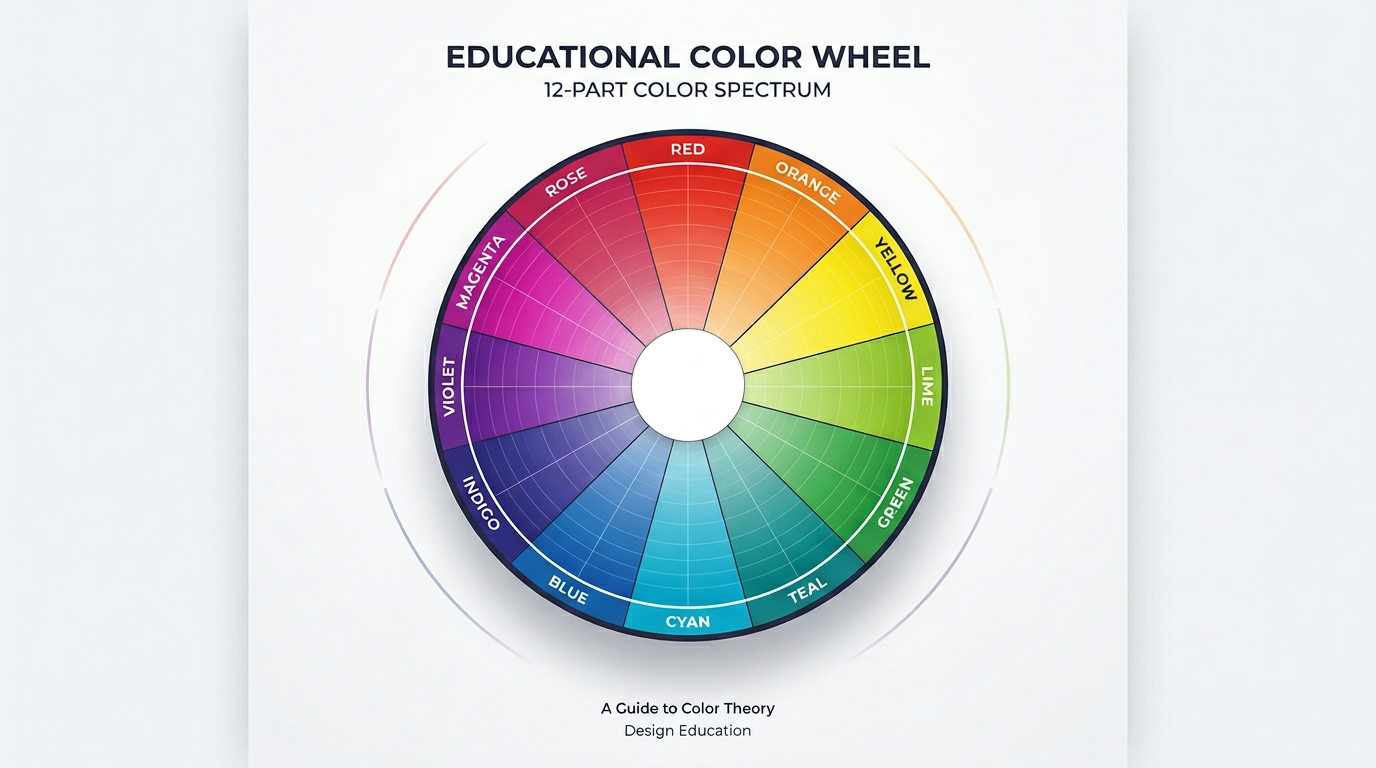
What Are Complementary Colors?
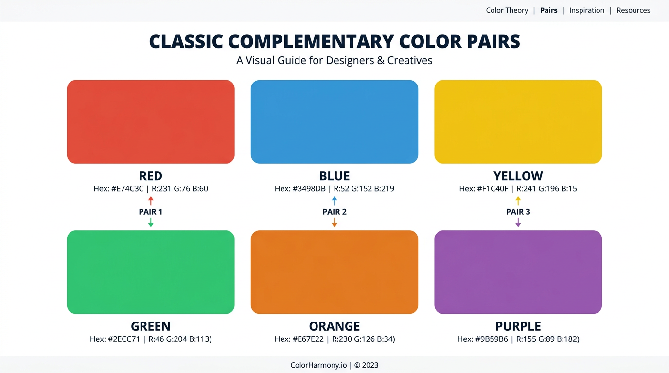
Complementary colors are pairs of colors positioned directly opposite each other on the color wheel. Because they share no common hues, they produce the highest possible contrast when placed side by side — making each color appear more vivid. The three standard complementary pairs on the traditional RYB wheel are red/green, blue/orange, and yellow/purple.
Why do complementary colors work?
Opponent process theory explains why complementary colors intensify each other: our eyes encode color in opposing channels (red-green, blue-yellow). When both members of a pair are present, each channel is maximally stimulated, creating the strongest visual response. Learn more in our color theory guide.
How to use complementary colors in design
Use one color as dominant (60%) and the other as accent (30–40%). Ensure WCAG contrast for text. Blue and orange is popular in UI; red and green in branding. See practical tips in our design guide.
Color Contrast Checker
Test text readability. Auto-filled from your selected color pair above.
Contrast ratio: 4.5:1
- WCAG AA (normal): —
- WCAG AA (large): —
- WCAG AAA (normal): —
- WCAG AAA (large): —
Good for body text
Frequently Asked Questions
-
What is the complementary color of blue?
The complementary color of blue is orange on the traditional RYB color wheel. In digital design using the RGB model, blue's complement is yellow. Blue and orange together create strong visual contrast, which is why they are widely used in sports branding and film posters.
-
What are the 3 pairs of complementary colors?
On the traditional RYB color wheel, the three primary complementary pairs are red and green, blue and orange, and yellow and purple. These pairs sit directly opposite each other and create maximum color contrast.
-
Why do complementary colors vibrate when placed together?
Complementary colors appear to vibrate due to simultaneous contrast — a phenomenon described by Josef Albers. When two opposite hues are placed side by side, each makes the other appear more intense. Your eyes perceive the edges more sharply, creating a subtle vibrating effect. Learn more in our color theory guide.
-
What is the difference between complementary and analogous colors?
Complementary colors sit opposite each other on the color wheel and create high contrast. Analogous colors sit next to each other and create harmonious, low-contrast schemes. Complementary pairs are bold; analogous groups are subtle and cohesive. Explore analogous colors.
-
How do I find the complementary color of any hex code?
Use the tool at the top of this page. Paste your hex code into the input field and press Enter — the complementary color appears instantly. You can also use the color wheel to pick any color, or the eyedropper to sample from your screen.
-
Are complementary colors the same as contrasting colors?
Not exactly. Complementary colors are hues opposite on the color wheel — they create chromatic (hue) contrast. Contrasting colors can also mean value contrast — how light or dark a color is. A light blue and dark blue have value contrast but are not complementary. Complementary pairs often have both hue and value contrast.
Explore More
Learn Color Theory
Hue, saturation, value, and color harmony explained.
Explore the Color Wheel
How the wheel works and interactive exploration.
Colors in Design
UI, branding, and visual design applications.
All Color Tools
Palette generator, color picker, and more.
All Color Pairs
Every complementary pair with examples.
Colors in the Real World
Fashion, interior design, and real-world uses.