Complementary Colors in Design: Complete Guide
Complementary colors create maximum visual contrast and are essential in design for hierarchy, emphasis, and accessibility. Whether you're designing for web, branding, or print, understanding how to use complementary colors effectively will elevate your work.
Why Complementary Colors Work in Design
Complementary pairs create strong contrast because they sit opposite each other on the color wheel. This contrast draws attention, creates focal points, and helps users understand hierarchy. When used correctly, complementary colors enhance readability and usability.
Web & UI Design
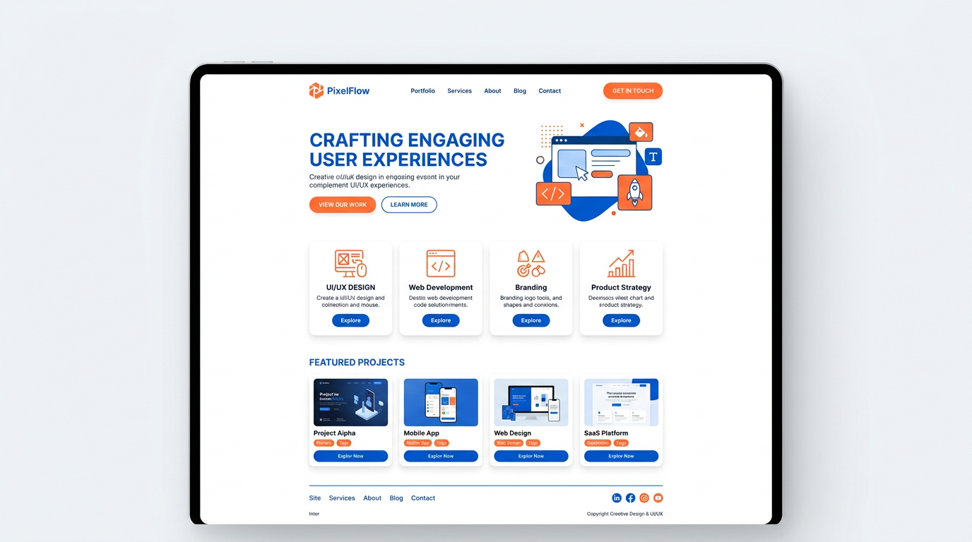
In web design, complementary colors are ideal for call-to-action buttons, links, and important elements. Blue and orange is a common choice for tech and SaaS. Red and green work for CTAs but must be used carefully—WCAG 2.1 requires 4.5:1 contrast for normal text. For more on complementary colors in UI/UX design, see our full guide.
Branding & Logos
Many iconic brands use complementary pairs. Harley-Davidson (orange and blue), FedEx (orange and purple), and the Los Angeles Lakers (purple and gold) all leverage complementary contrast for memorability. The key is to choose one color as dominant and the other as accent.
Color Contrast and Accessibility
WCAG 2.1 guidelines specify minimum contrast ratios: 4.5:1 for normal text, 3:1 for large text. Complementary colors can meet these ratios when you use appropriate tints and shades. Test your palettes with a contrast checker tool.
Color Contrast Checker
Test text readability. Enter hex codes or use the color pickers to verify WCAG compliance.
Contrast ratio: 4.5:1
- WCAG AA (normal): —
- WCAG AA (large): —
- WCAG AAA (normal): —
- WCAG AAA (large): —
Good for body text
Related Articles
Frequently Asked Questions
How do you use complementary colors in design?
Use one color as dominant and the other as accent. Ensure WCAG contrast for text. Test on real devices.
What is the best complementary color for blue?
Orange is the complementary color of blue. Blue and orange create strong contrast and are popular in UI and branding.