Split-Complementary Colors Explained
A split-complementary color scheme uses one base color plus the two colors adjacent to its complement on the color wheel. Instead of using the direct opposite (as with complementary colors), you use the colors on either side of the complement. This creates strong contrast with less visual tension than a pure complementary pair.
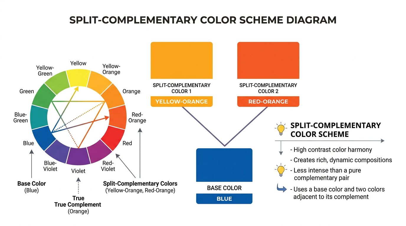
How Split-Complementary Works
On a 12-segment color wheel, if your base color is blue, its complement is orange. The split-complementary scheme uses yellow-orange and red-orange instead of orange. You get three colors: blue, yellow-orange, and red-orange. The result is more nuanced than blue-orange alone.
Split-Complementary vs. Complementary
Complementary uses two colors (base + opposite). Split-complementary uses three (base + two adjacent to opposite). Complementary has maximum contrast; split-complementary has high contrast with more harmony. Use our color finder to see split-complementary pairs for any hex code.
Examples
Blue with yellow-orange and red-orange. Green with red-purple and red-orange. Red with teal and yellow-green. Each creates a balanced, vibrant palette.
Using Split-Complementary in Design
Use the base color as dominant (60%), one split as secondary (30%), the other as accent (10%). Works well in UI design, branding, and interiors. Less aggressive than pure complementary.
Try It: Find Split-Complementary Colors
Enter a hex code or pick a color to see its complement, split-complementary, and triadic palettes.
Complementary
Split-complementary
Triadic
Related Articles
Frequently Asked Questions
What is a split-complementary color scheme?
Split-complementary uses one base color plus the two colors adjacent to its complement on the color wheel. It offers contrast with less tension than pure complementary.