Triadic Color Scheme: Guide + Examples
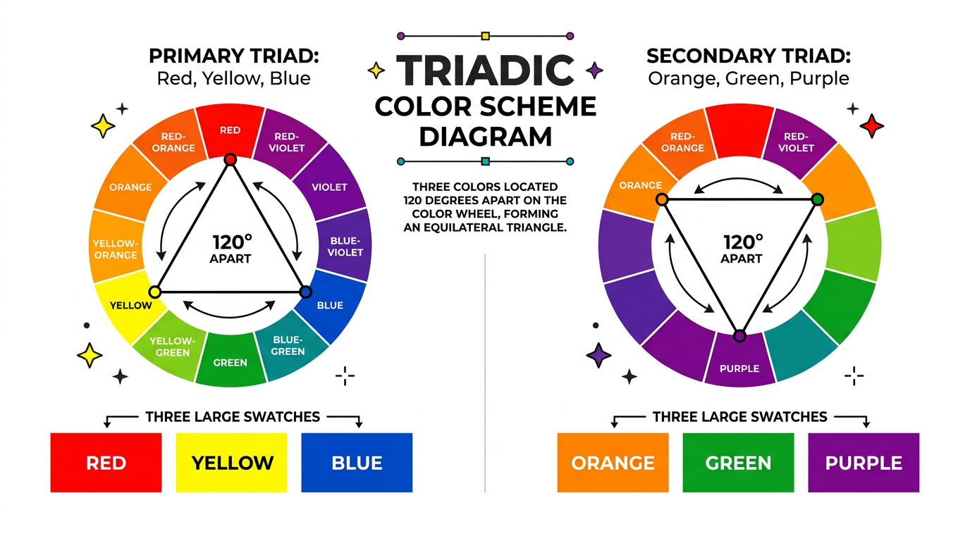
A triadic color scheme uses three colors evenly spaced 120° apart on the color wheel. The primary triadic set is red, yellow, and blue. Secondary triads include orange, green, and purple. Triadic schemes offer vibrant contrast while maintaining balance—different from complementary colors (two opposites) but equally dynamic.
How Triadic Works
Place an equilateral triangle on the color wheel. The three points indicate your triadic colors. Each is 120° from the others. This creates a balanced, high-contrast palette. Use our color finder to see triadic sets for any hex code.
Triadic vs. Complementary
Complementary uses two opposite colors. Triadic uses three evenly spaced colors. Complementary has maximum two-color contrast; triadic has balanced three-color contrast. Triadic can feel more playful; complementary more dramatic.
Examples
Red, yellow, blue (primary). Orange, green, purple (secondary). Use one dominant (60%), one secondary (30%), one accent (10%). Works in branding, UI, and illustration.
Using Triadic in Design
Balance saturation and value—avoid using all three at full intensity. Use tints and shades. Effective in UI/UX design when used subtly. The color wheel shows the relationship.
Try It: Find Triadic Colors
Enter a hex code or pick a color to see its complement, split-complementary, and triadic palettes.
Complementary
Split-complementary
Triadic
Related Articles
Frequently Asked Questions
What is a triadic color scheme?
A triadic color scheme uses three colors evenly spaced 120° apart on the color wheel. Examples: red, yellow, blue or orange, green, purple.