Complementary Colors in Real Life: Industry Use Cases
Complementary colors appear everywhere—from fashion runways to living rooms to brand logos. Understanding how industries use complementary colors helps you apply them effectively in your own projects.
Fashion
Fashion designers use complementary pairs for bold outfits and accessories. Red and green, blue and orange, and purple and yellow create striking combinations. Learn more in our complementary colors in fashion guide.
Interior Design
Interior designers apply the 60-30-10 rule with complementary colors: 60% dominant, 30% secondary, 10% accent. Use tints and shades for subtle schemes. See our interior design guide for details.
Branding
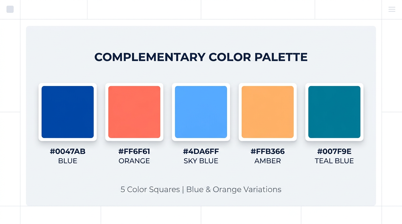
Brands like Harley-Davidson (orange/blue), FedEx (orange/purple), and the Lakers (purple/gold) use complementary pairs for memorability. The contrast helps logos stand out.
Art and Photography
Artists from the Impressionists to modern photographers use complementary colors for visual impact. Blue and orange is especially popular in cinematic color grading.
Find Complementary Colors
Enter a hex code or pick a color to see its complement, split-complementary, and triadic palettes.
Complementary
Split-complementary
Triadic
Related Articles
- Complementary Colors in Fashion
- Complementary Colors in Interior Design
- Design Applications
- Color Wheel Guide
Frequently Asked Questions
Where are complementary colors used?
Complementary colors are used in fashion, interior design, branding, web design, photography, and art. They create contrast and visual interest.