Complementary Colors in Interior Design
Complementary colors add energy and balance to interior spaces. Use the 60-30-10 rule: 60% dominant (walls, furniture), 30% secondary, 10% accent. For subtle schemes, use tints and shades rather than pure hues. Blue and orange, green and red, or purple and yellow create striking combinations. Learn more about complementary colors on our homepage.
The 60-30-10 Rule
Apply 60% of your color to walls and large surfaces, 30% to furniture and upholstery, 10% to accents (pillows, art, accessories). This prevents overwhelming contrast while keeping the palette cohesive.
Popular Pairs for Interiors
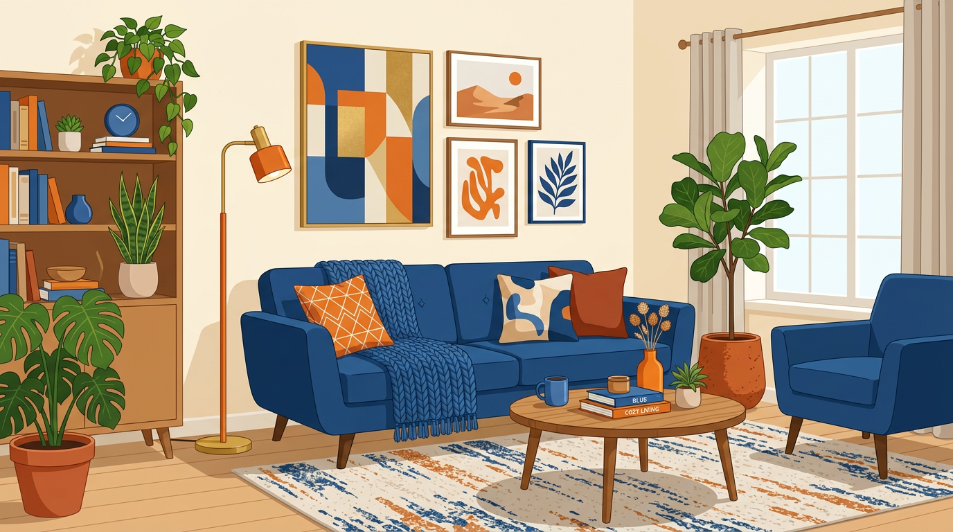
Blue and orange: coastal, modern. Navy walls with terracotta accents. Green and red: traditional, festive—use sage and burgundy for sophistication. Purple and yellow: bold, creative. Brown and blue: natural, rustic—wood with blue textiles.
Using Tints and Shades
Pure complementary pairs can be intense. Use tints (add white) or shades (add black) for softer schemes. Blush pink with sage green. Soft blue with warm beige (orange tint). The hue, saturation, value guide explains these concepts.
Room-by-Room Tips
Living rooms: neutral base with complementary accents. Bedrooms: cool dominant (blue, green) with warm accents for relaxation. Kitchens: white or wood with blue or green accents. Use our palette generator for inspiration.
Find Complementary Colors
Enter a hex code or pick a color to see its complement, split-complementary, and triadic palettes.
Complementary
Split-complementary
Triadic
Related Articles
Frequently Asked Questions
How do you use complementary colors in interior design?
Use the 60-30-10 rule: 60% dominant color, 30% secondary, 10% accent. Use tints and shades for subtle schemes. Blue and orange, or green and red, work well.