Warm vs. Cool Colors: The Complete Guide
Warm colors (red, orange, yellow) advance visually and feel energetic. Cool colors (green, blue, purple) recede and feel calm. Complementary colors often pair one warm with one cool—red and green, blue and orange, yellow and purple—creating balance and depth.
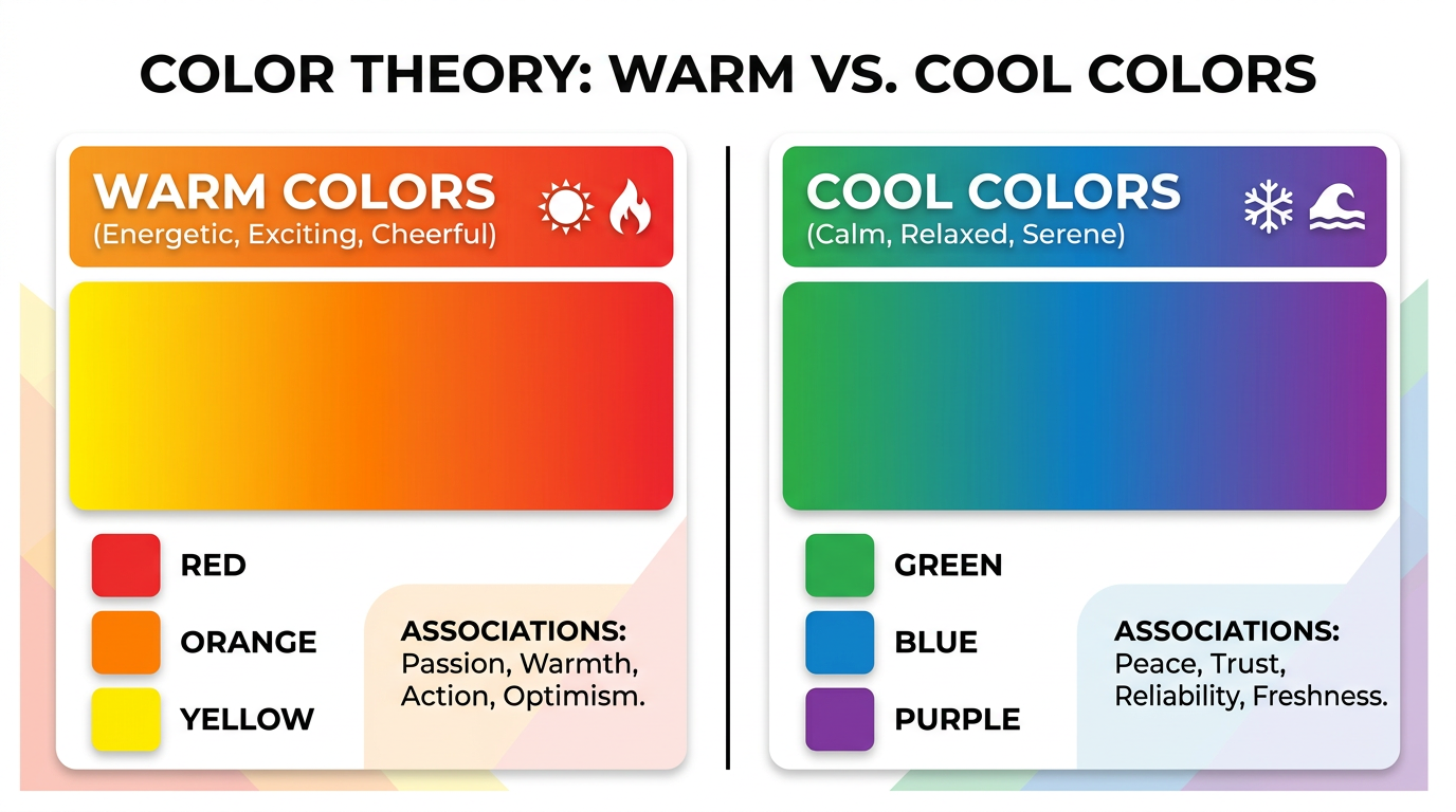
Warm Colors
Red, orange, and yellow evoke fire, sun, and warmth. They advance in space, feel active, and attract attention. Use warm colors for CTAs, highlights, and energy. In the Munsell system, warm hues sit on one half of the wheel.
Cool Colors
Green, blue, and purple evoke water, sky, and shadow. They recede, feel calm, and suggest trust. Use cool colors for backgrounds, trust signals, and relaxation. Many tech brands use blue as primary.
Warm-Cool Balance in Complementary Pairs
Red (warm) + green (cool). Blue (cool) + orange (warm). Yellow (warm) + purple (cool). This balance adds visual interest and helps create depth. Josef Albers showed how warm and cool interact when adjacent.
Using Warm and Cool in Design
Use warm for emphasis and cool for background. Or reverse for bold effect. The color wheel shows the split—roughly red through yellow-green are warm; green through red-purple are cool.
Try It: Find Complementary Colors
Enter a hex code or pick a color to see its complement, split-complementary, and triadic palettes.
Complementary
Split-complementary
Triadic
Related Articles
Frequently Asked Questions
What are warm colors?
Warm colors are red, orange, and yellow. They advance visually and feel energetic. Cool colors are green, blue, and purple—they recede and feel calm.